The biggest Wear OS update in years has arrived: Here’s what it looks like
Earlier today, the Google I/O 2021 developer conference kicked off, and there was a lot of major news announced. From several new features and improvements to many services in the Google ecosystem to news that’ll make developers’ lives easier, Google I/O 2021 has been one of the biggest tech events in years. Of course, the biggest announcement at the event was the official unveiling of Android 12 for smartphones. But not every Android announcement was centered around phones. Google is finally giving more attention to Android for smartwatches and the Wear OS ecosystem once again, starting with a new version that’s one of the biggest updates to Wear OS since it was first introduced.
This new version of Wear OS is especially notable because it’s not just yet another rebase on top of a new Android version. Instead, Google surprised many by announcing that it collaborated with Samsung to rebuild the platform. Samsung has shown its commitment to the rebuilt smartwatch platform by announcing that they are going to make new Galaxy smartwatches with Wear OS instead of the company’s Tizen, and they collaborated with Google to take some of the features that make Tizen so beloved by users and brought them over to Wear OS. The results speak for themselves. The new version of Wear OS looks fresh.
While we don’t have any hardware running the new version of Wear OS just yet, Google has updated the official Wear emulator image in Android Studio, so we got our hands on it to see some of the changes.
Design changes: Material You is coming!
First off, we need to talk about the new design. Google announced a new design language for its range of products, Material You, in their keynote today, and it’s the theme that Android 12 devices, at least those running stock Android, will be running. It puts a bigger focus on personalization than any other iteration of Material Design that came before it, and it’s quite likely the biggest design change from Google since 2014 when they announced their original Material Design guidelines alongside Android 5.0 Lollipop. Wear OS will be following these guidelines as well, and they blend in perfectly with the smaller form factor smartwatches powered by this operating system.


The new design guidelines can be seen on everything from smartwatches, to menus, to notifications, and everything in between. Items in the app list are enclosed in pills, notifications feature considerably more rounded corners, and bold typefaces can be seen everywhere. This is a notable difference from the previous Material Theme guidelines that were featured in previous versions of Wear OS. They also blend in beautifully with the new stock Android design language, but they’re definitely more subtle than their smartphone counterpart. Some changes are very subtle, especially compared to how they were before, while others are immediately noticeable. These new design changes also apply to Google apps as well.
First off, the new app drawer features an elongated pill-shaped design on each item, similar to what we’ve seen in some Google widgets. It doesn’t differ much in functionality from previous Wear OS versions, but it manages to look much slicker and more elegant.
Wear OS doesn’t have wallpapers, so Android 12’s wallpaper-based theming system is nowhere to be seen here. We should also note here that this new version of Wear OS is based on Android 11, despite featuring the newer Material You design guidelines. The default watch face that is visible in the screenshots is also pretty much just that: a default watch face. Each OEM will put its own spin on the watch face.
The quick settings menu is also greatly revamped with usability in mind. A smaller display also makes small buttons harder to tap, so the newly designed quick settings menu in Wear OS uses bigger, easier-to-tap buttons to improve usability. Sections like brightness also use buttons instead of the typical slider used in smartphones with exactly this in mind. Tiles are also getting a revamp in both looks and functionality: now, while swiping through them, it’ll wrap around when you reach the end. Google Assistant is also not available anymore when swiping left: you now need to double-tap the power button to access it. Other gestures include double-tapping the back button to switch between apps.
Finally, notifications feature an all-new design that, for once, is more in line with what can be seen on Android smartphones. Notifications feature a gradient design with rounded corners and can be expanded by holding on them if the full notification is not visible at a glance.
The best of Fitbit now in Wear OS — and more apps and features!
Google also announced that the best features of Fitbit, the fitness brand that Google recently acquired, are coming to Wear OS smartwatches. Wear OS will be able to track your exercise, track how many steps you’ve taken, track your health progress throughout the day, and even show on-wrist goal celebrations to cheer you up and motivate you in your journey to a more healthy life. It’s not clear if some features will require extra hardware support or if they will be compatible with existing Wear OS hardware.
This doesn’t mean that smartwatches will be replacing fitness bands anytime soon. There are plenty of smartwatches out there with fitness tracking capabilities and a lot of them have special sensors with that purpose in mind. Fitness bands still have a place in the market because they’re considerably cheaper and don’t really come with the same level of features a smartwatch does.
.@Fitbit‘s popular features are coming to Wear OS! Track your health progress throughout the day, stay motivated with on-wrist celebrations and more.
For all the details: https://t.co/e2p4lqogDR pic.twitter.com/a9n3arzmE7
— Wear OS by Google (@WearOSbyGoogle) May 18, 2021
Google is also committed to bringing more and better apps to the Wear OS ecosystem. Fitbit is just one step to get there: other Google services like Google Maps and Google Assistant are also being revamped to offer an all-around better experience on smartwatches. And other apps? Well, Google very recently brought Gboard to the platform, and they also want to make it easier for developers to bring their own apps to Wear OS, which brings us to our next point…
Developers can get in on the action now!
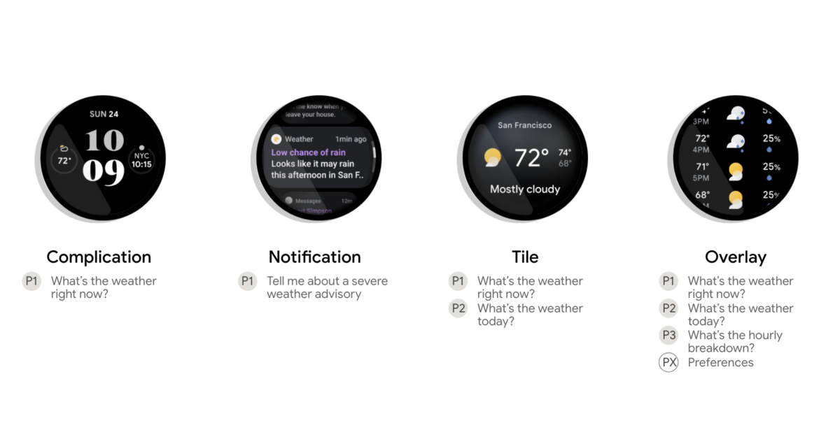
Google is also pushing developers making Wear OS apps to follow these guidelines and APIs to the letter—yes, even design-wise. The Wear OS UI documentation in Android’s developer portal has been changed to show off the new design language, and how developers need to go around following it. The new Material You design language applies to notifications, complications (small widgets that go in the watch face), overlays, tiles, app launchers, and, if you want to, watch faces, and you can either stick to them or follow them closely while also giving apps your own personalized spin.


This update is being touted as “the biggest update to Wear OS” ever. And we sure see what Google means by that. Google even got Samsung on board with the new Wear OS version, which is impressive considering that Samsung has been developing a smartwatch OS in the form of Tizen. Wear OS is set to play a much more central role in Google’s ecosystem from this point onwards.
In preparation for the new version of Wear OS, Google has also released several developer tools and APIs for getting developers started on making their apps work with this new operating system. As part of these updates, new Jetpack APIs are being added, such as the Tiles API, which is meant to open up Wear OS Tiles to everyone and make it easy for developers to work with them. There’s also the Ongoing Activities API, which allows your users to return to your app after they’ve navigated away (to start a different task, such as music playback) by tapping an activity indicator icon at the bottom of the watch face, double-tapping the side button, or using the Recents section of the app list.
Last but not least, we also have Health Services, which is a health and fitness platform created in collaboration with Samsung (and probably what Fitbit’s features are relying upon for their Wear OS support). This platform offers exercise and health data derived from sensors, as well as contextually aware algorithms and continuous health monitoring. The APIs can be used to build high-quality, efficient fitness and health experiences for wearables while requiring less development time.
If Google’s promises for Wear OS in 2021 are upheld, we might be looking at the biggest revamp of the Android-based smartwatch platform since its initial launch. Wear OS-powered smartwatches might actually become competitive with the Apple Watch so long as we also get better hardware, which is almost a certainty now that Samsung is on board. What do you think of the new version of Wear OS?
The post The biggest Wear OS update in years has arrived: Here’s what it looks like appeared first on xda-developers.
from xda-developers https://ift.tt/2SSsosW
via IFTTT
 Reviewed by site
on
19:09
Rating:
Aucun commentaire: